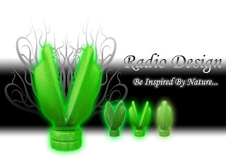
 yeah this is my hero shot~~
basically just cut out the radio i've taken using photoshop and change the color of it~~
...yeah can't use photoshop so just did some basic editing T.T
o well hope u guys like it lol
i haven't stack any details of the radio on yet~~ i am still thinking if i should do it or if i should sand the details out using sand paper~ which probably give it a better finish overall ~~
- Beichen
4 comments:
Be, done it again mate.
simple page layout but looks terrific, the colouring suites the inspiration nicely chosen, i like the different angles and how you have shown it in its open and closed form. maybe now you could give it a name.
great stuff.
Jason T
Ahhh B! The green glow is really cool... it's like it's magical and I want to open it!
I'm not really a fan of the half gradient text though, it makes it a little hard to read.
Oh! and I like the pattern behind the pictures... very organic.
Laura.
Hey BEEE! looks mad as man. love how you made ur product stand out against the background by putting a glowing effect. Also i think that showing a progressive image of how your radio opens you. well structured presentation and awesome product
:D
joseph
hey biechen, you've shown throughout this blog that your presentation skills are excellent.
Perhaps a view from on top could have been used rather than another view from the side.
Well done on the model btw, must of been tough.
-kyle
Post a Comment